DE on GLI3 knockout dataset
This tutorial demonstrates how to perform comprehensive differential expression analysis on the Gli3-KO dataset using the delnx package. We will cover pseudobulking, differential expression analysis, and visualization.
Table of Contents
1. Setup and Data Loading
%load_ext autoreload
%autoreload 2

%config InlineBackend.figure_format = 'retina'

import numpy as np
import pandas as pd
import scanpy as sc
import matplotlib as mpl
import matplotlib.pyplot as plt
import delnx as dx
from pathlib import Path

# Global Scanpy settings
sc.settings.verbosity = 2  # Show progress
sc.settings.set_figure_params(
    dpi=150,  # High-res output
    dpi_save=300,  # High-res when saving
    format="png",  # or 'pdf', 'svg'
    facecolor="white",  # or 'none' for transparent
    frameon=False,  # No outer frame
    vector_friendly=True,  # No rasterization warnings
    fontsize=10,  # Base font size
    figsize=(4, 4),  # Default figure size
    transparent=True,  # Transparent background if saving
)

mpl.rcParams.update(
    {
        "svg.fonttype": "none",  # Keep SVG text selectable
        "pdf.fonttype": 42,  # Embed fonts in PDFs (TrueType)
        "legend.fontsize": 6,
        "axes.titlesize": 6,
        "xtick.labelsize": 6,
        "ytick.labelsize": 6,
    }
)

# Optional: remove scanpy's auto-show
sc.settings.autoshow = False

# Setup keys
sample_key = "batch"
group_key = "cell_type"
condition_key = "condition"
Load & Visualize data
# Load the dataset
adata_path = Path("data/GLI3_KO_45d.h5ad")
adata = sc.read(adata_path)

# Remove unwanted cell types
adata = adata[~adata.obs["cell_type"].isin(["ctx_ip", "ctx_ex", "ctx_npc"])]

# Make sure the metadata is formatted as categoricals
adata.obs[sample_key] = adata.obs["organoid"].astype(str)
adata.obs[sample_key] = pd.Categorical(adata.obs[sample_key], ordered=True)
adata.obs[group_key] = adata.obs["cell_type"].astype(str)
adata.obs[group_key] = pd.Categorical(adata.obs[group_key], ordered=True)
adata.obs[condition_key] = adata.obs["GLI3_KO"].astype(str)
adata.obs[condition_key] = pd.Categorical(adata.obs[condition_key], ordered=True)
# Store raw counts in a separate layer
adata.layers["counts"] = adata.X.copy()
# Store whole object under raw (this is needed for dotplots)
adata.raw = adata.copy()
# Some basic preprocessing
sc.pp.normalize_total(adata, target_sum=1e4)
sc.pp.log1p(adata)
normalizing counts per cell
    finished (0:00:02)
adata
AnnData object with n_obs × n_vars = 19844 × 18653
    obs: 'organoid', 'GLI3_KO', 'cell_type', 'batch', 'condition'
    uns: 'log1p'
    obsm: 'pca', 'umap'
    layers: 'counts'
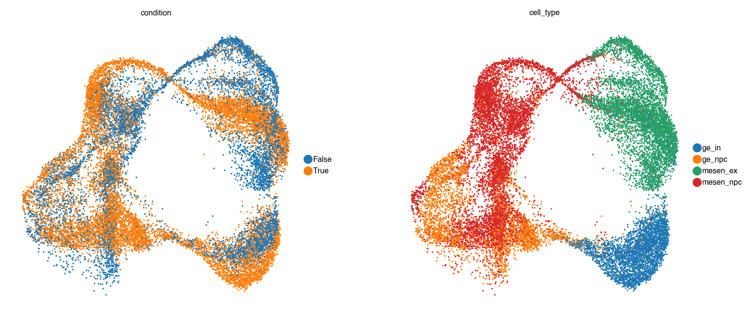
sc.pl.umap(adata, color=[condition_key, group_key])
[<Axes: title={'center': 'condition'}, xlabel='UMAP1', ylabel='UMAP2'>,
 <Axes: title={'center': 'cell_type'}, xlabel='UMAP1', ylabel='UMAP2'>]
Filter out lowly detected genes
Before downstream analysis, we remove genes with very low overall expression across all cells.
# Filter genes: keep those with total counts above the 25th percentile
from scipy import sparse
total_counts = np.array(adata.layers["counts"].sum(axis=0)).flatten()
threshold = np.percentile(total_counts[total_counts > 0], 25)
keep_mask = total_counts > threshold
print(f"Keeping {keep_mask.sum()} / {len(keep_mask)} genes (threshold: {threshold:.0f} counts)")
Keeping 12086 / 18653 genes (threshold: 92 counts)
adata = adata[:, keep_mask].copy()
2. Pseudobulking
Pseudobulking is a common preprocessing step in single-cell differential expression analysis. Instead of analyzing individual cells—which introduces challenges due to sparsity, high variability, and non-independence—we aggregate expression values across biologically meaningful groups, such as cell types and samples.
In this step, we:
Group cells by a combination of categories (e.g.,
cell_type,sample,condition).Sum or average the raw counts for each gene across all cells in each group.
Construct a pseudobulk matrix, where each column corresponds to one group and each row to a gene.
This transforms sparse single-cell data into a bulk-like format that can be analyzed using well-established bulk RNA-seq differential expression tools such as edgeR, DESeq2, or limma-voom
adata_pb = dx.pp.pseudobulk(
    adata,
    sample_key=sample_key,  # Sample key for pseudobulk aggregation (the biological replicate)
    group_key=group_key,  # Group key for pseudobulk aggregation
    layer="counts",  # Layer to use for pseudobulk aggregation, e.g. "counts" or None for adata.X
    mode="sum",
)

print(adata_pb)
AnnData object with n_obs × n_vars = 28 × 12086
    obs: 'psbulk_replicate', 'cell_type', 'organoid', 'GLI3_KO', 'batch', 'condition', 'psbulk_cells', 'psbulk_counts'
    layers: 'psbulk_props'
3. Differential Expression Analysis
# Compute size factors
dx.pp.size_factors(adata_pb, method="ratio")
# Run per-cell-type negative binomial DE
results = dx.tl.grouped(
    dx.tl.nb_de,
    adata_pb,
    group_key=group_key,
    condition_key=condition_key,
    reference="False",
    contrast="condition[T.True]",
)
INFO     Running DE for group: ge_in
INFO     Fitting 12086 genes with 2 coefficient(s) (batch_size=512)
INFO     Applying quasi-likelihood shrinkage
INFO     Running DE for group: ge_npc
INFO     Fitting 12086 genes with 2 coefficient(s) (batch_size=512)
INFO     Applying quasi-likelihood shrinkage
INFO     Running DE for group: mesen_ex
INFO     Fitting 12086 genes with 2 coefficient(s) (batch_size=512)
INFO     Applying quasi-likelihood shrinkage
INFO     Running DE for group: mesen_npc
INFO     Fitting 12086 genes with 2 coefficient(s) (batch_size=512)
INFO     Applying quasi-likelihood shrinkage
results.head()
| feature | log2fc | coef | stat | pval | padj | group | |
|---|---|---|---|---|---|---|---|
| 0 | LHX8 | 8.398307 | 5.821263 | 290.310323 | 1.550281e-10 | 0.000007 | ge_in |
| 1 | SFTA3 | 9.072671 | 6.288696 | 255.404138 | 3.550870e-10 | 0.000009 | ge_in |
| 2 | LHX6 | 7.450785 | 5.164491 | 132.413622 | 2.269491e-08 | 0.000274 | ge_in |
| 3 | SOX6 | 2.647630 | 1.835197 | 119.430943 | 4.282508e-08 | 0.000414 | ge_in |
| 4 | MEIS2 | -2.522473 | -1.748445 | 110.013110 | 7.068006e-08 | 0.000479 | ge_in |
4. Visualization
Once differential expression analysis has been performed, it’s important to visualize the results to interpret and communicate key findings.
We explore the results at multiple levels:
Volcano plots to visualize the magnitude and significance of gene-level changes.
Matrix plots and Dot plots to summarize the expression of differentially expressed genes across multiple conditions or groups.
Violin plots to compare selected genes across specific conditions and cell types.
Label DE genes
We use get_de_genes to label genes as upregulated, downregulated, or not significant based on effect size and p-value thresholds.
from delnx._utils import get_de_genes

# Label DE genes and get per-group gene lists
de_genes_dict, results = get_de_genes(
    results,
    group_key="group",
    effect_key="log2fc",
    pval_key="pval",
    effect_thresh=2,
    pval_thresh=0.05,
    return_labeled_df=True,
)
results.head(10)
| feature | log2fc | coef | stat | pval | padj | group | -log10(pval) | significant | |
|---|---|---|---|---|---|---|---|---|---|
| 0 | LHX8 | 8.398307 | 5.821263 | 290.310323 | 1.550281e-10 | 0.000007 | ge_in | 9.809589 | Up |
| 1 | SFTA3 | 9.072671 | 6.288696 | 255.404138 | 3.550870e-10 | 0.000009 | ge_in | 9.449665 | Up |
| 2 | LHX6 | 7.450785 | 5.164491 | 132.413622 | 2.269491e-08 | 0.000274 | ge_in | 7.644072 | Up |
| 3 | SOX6 | 2.647630 | 1.835197 | 119.430943 | 4.282508e-08 | 0.000414 | ge_in | 7.368302 | Up |
| 4 | MEIS2 | -2.522473 | -1.748445 | 110.013110 | 7.068006e-08 | 0.000479 | ge_in | 7.150703 | Down |
| 5 | CDCA7L | -3.146040 | -2.180669 | 90.405516 | 2.300047e-07 | 0.001010 | ge_in | 6.638263 | Down |
| 6 | C12orf75 | 1.648706 | 1.142796 | 86.331484 | 3.022945e-07 | 0.001217 | ge_in | 6.519570 | NS |
| 7 | CALB2 | -2.726589 | -1.889927 | 84.480440 | 3.435467e-07 | 0.001277 | ge_in | 6.464014 | Down |
| 8 | MPPED2 | -1.181557 | -0.818993 | 77.860964 | 5.542778e-07 | 0.001913 | ge_in | 6.256273 | NS |
| 9 | PDE5A | -3.828855 | -2.653960 | 74.391434 | 7.224100e-07 | 0.002181 | ge_in | 6.141216 | Down |
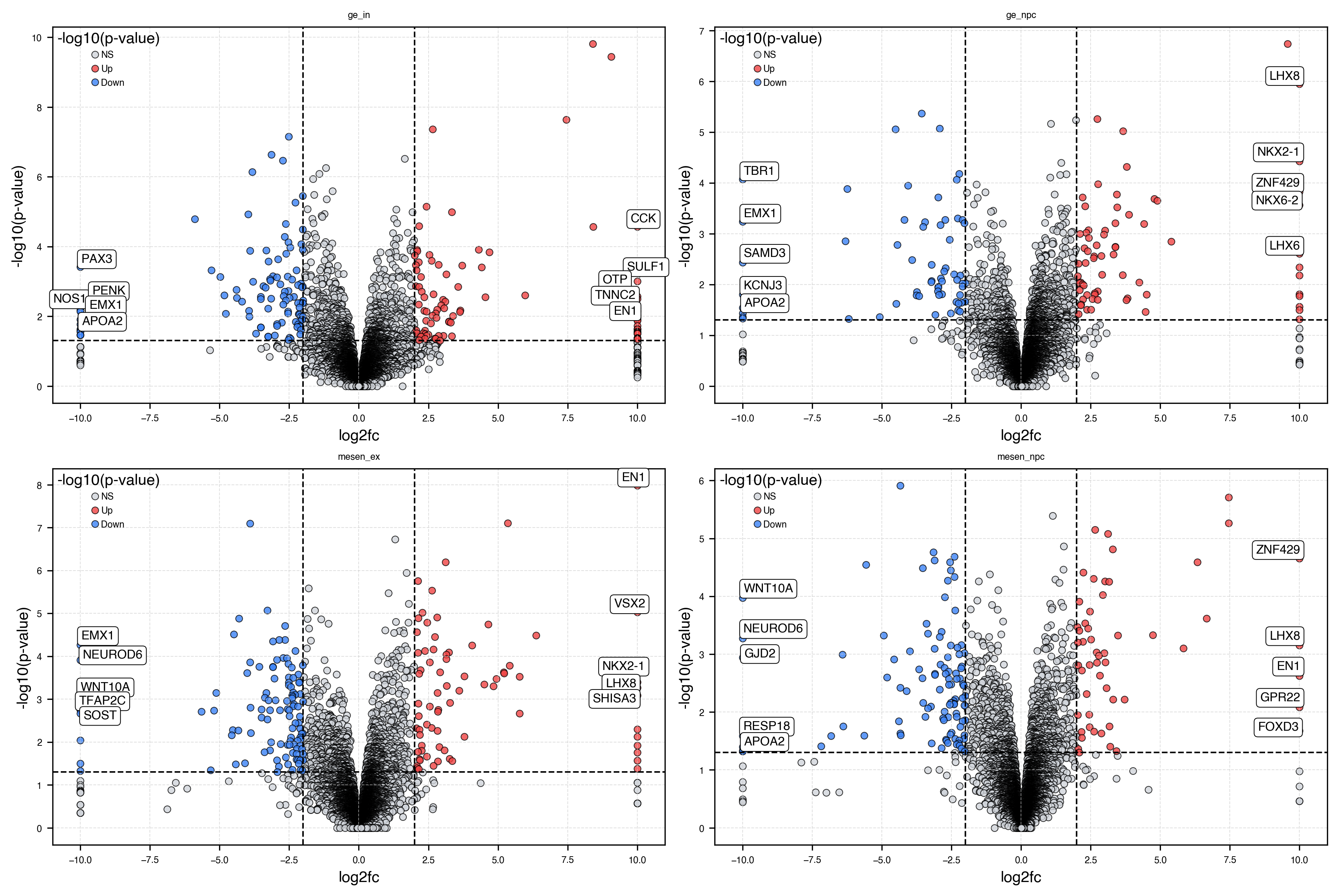
Plot volcano plots
# Select groups to show
groups_to_plot = ["ge_in", "ge_npc", "mesen_ex", "mesen_npc"]

fig, axs = plt.subplots(nrows=2, ncols=2, figsize=(12, 8), constrained_layout=True)
axs = axs.flatten()

for i, group in enumerate(groups_to_plot):
    ax = axs[i]
    de_df = results[results["group"] == group].copy()
    dx.pl.volcanoplot(
        de_df,
        effect_thresh=2,
        pval_thresh=0.05,
        label_top=5,
        ax=ax,
        show=False,
    )
    ax.set_title(group)

# Remove empty axes if any
for j in range(len(groups_to_plot), len(axs)):
    fig.delaxes(axs[j])

plt.show()
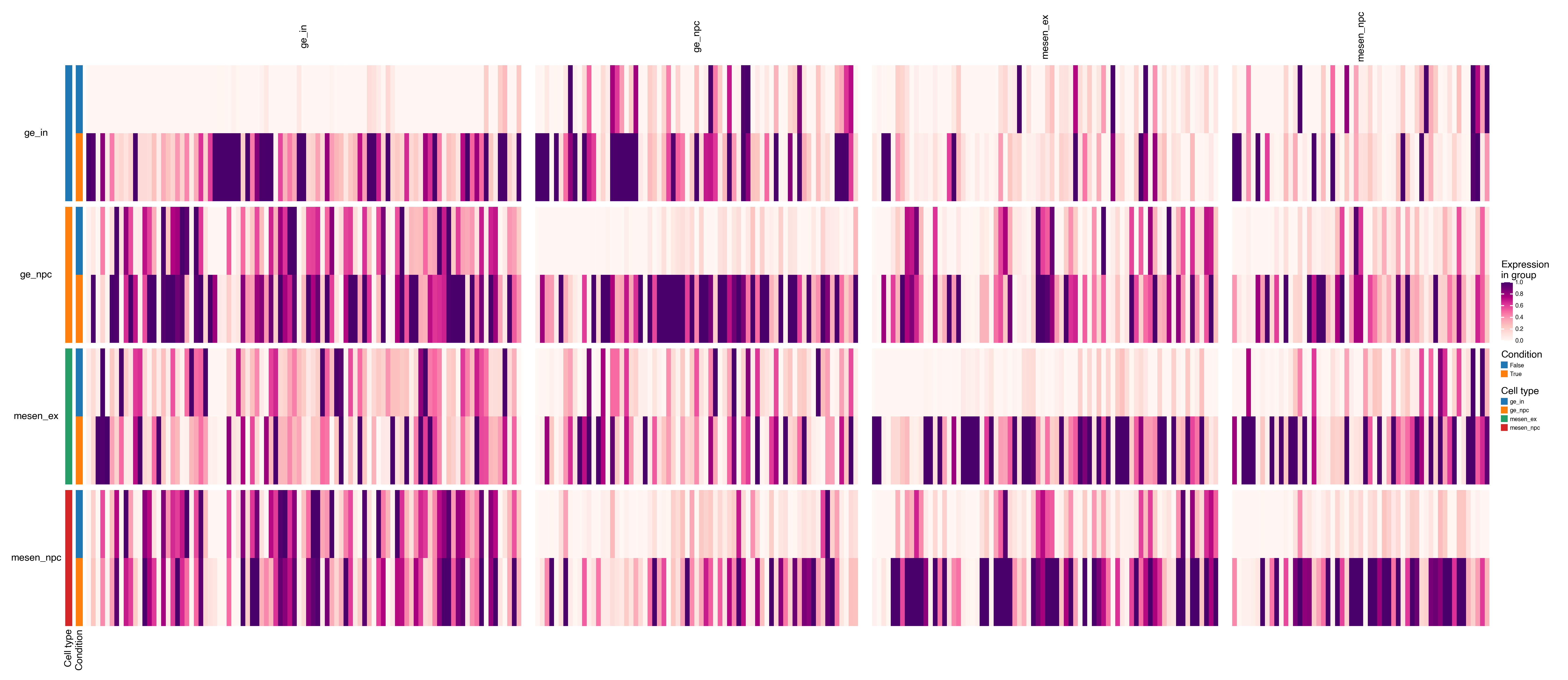
Plot matrix/dotplots
top_up_per_group = (
    results[results["significant"] == "Up"]  # only upregulated genes
    .drop_duplicates(subset=["group", "feature"], keep="first")  # remove group-feature duplicates
    .sort_values(["group", "log2fc"], ascending=[True, False])  # sort by group and descending log2fc
)
top_up_per_group.head()
| feature | log2fc | coef | stat | pval | padj | group | -log10(pval) | significant | |
|---|---|---|---|---|---|---|---|---|---|
| 34 | CCK | 10.0 | 23.319647 | 38.317248 | 0.000027 | 0.014874 | ge_in | 4.563734 | Up |
| 157 | SULF1 | 10.0 | 22.155796 | 17.459695 | 0.000995 | 0.093665 | ge_in | 3.002316 | Up |
| 227 | OTP | 10.0 | 21.681268 | 13.424596 | 0.002687 | 0.161615 | ge_in | 2.570812 | Up |
| 245 | TNNC2 | 10.0 | 20.583639 | 12.839357 | 0.003145 | 0.176984 | ge_in | 2.502397 | Up |
| 316 | EN1 | 10.0 | 20.596160 | 10.691634 | 0.005808 | 0.242498 | ge_in | 2.235969 | Up |
marker_dict = top_up_per_group[["feature", "group"]].groupby("group")["feature"].apply(list).to_dict()
dx.pl.matrixplot(
    adata,
    markers=marker_dict,
    groupby=[group_key, condition_key],
    group_names=["Cell type", "Condition"],
    row_grouping=[group_key],
    column_grouping=True,
    cmap="RdPu",
    scale=True,
    width=20,
    height=8,
    show_legends=True,
    show_column_names=True,
    show_row_names=True,
)
dx.pl.violinplot(adata, genes=["OTP", "CCK"], groupby=group_key, splitby=condition_key, use_raw=False, flip=True)
Intersect differentially expressed genes
# Extract all "up" gene sets from the dictionary (already computed above)
up_gene_sets = [set(v["up"]) for v in de_genes_dict.values()]

# Compute the intersection of all sets
common_up_genes = list(set.intersection(*up_gene_sets))
print(f"Common upregulated genes across all groups: {len(common_up_genes)}")
Common upregulated genes across all groups: 6
dx.pl.dotplot(
    adata,
    markers=common_up_genes,
    groupby=[group_key, condition_key],
    group_names=["Cell type", "Condition"],
    row_grouping=[group_key],
    column_grouping=True,
    dendrograms=["left", "top"],
    cmap="RdPu",
    scale=True,
    width=8,
    height=4,
    show_legends=True,
    show_column_names=True,
    show_row_names=True,
)
dx.pl.violinplot(adata, genes=common_up_genes, groupby=group_key, splitby=condition_key, use_raw=False, flip=True)
5. Gene Set Enrichment Analysis (GSEA)
# Run enrichment per group using the upregulated gene lists
background = adata.var_names.tolist()
enr_frames = []

for group, gene_dict in de_genes_dict.items():
    up_genes = gene_dict["up"]
    if len(up_genes) < 5:
        continue
    enr = dx.tl.gsea(
        up_genes,
        background=background,
    )
    enr["group"] = group
    enr["direction"] = "Up"
    enr_frames.append(enr)

    down_genes = gene_dict["down"]
    if len(down_genes) < 5:
        continue
    enr = dx.tl.gsea(
        down_genes,
        background=background,
    )
    enr["group"] = group
    enr["direction"] = "Down"
    enr_frames.append(enr)

enr_results = pd.concat(enr_frames, ignore_index=True)
print(f"Enrichment results: {len(enr_results)} terms across {enr_results['group'].nunique()} groups")
Enrichment results: 74334 terms across 4 groups
enr_results.head(10)
| Gene_set | Term | Overlap | P-value | Adjusted P-value | Odds Ratio | Combined Score | Genes | group | direction | |
|---|---|---|---|---|---|---|---|---|---|---|
| 0 | gs_ind_0 | AAACCAC_MIR140 | 1/92 | 0.510007 | 0.762220 | 2.109437 | 1.420350 | EYA2 | ge_in | Up |
| 1 | gs_ind_0 | AAAGACA_MIR511 | 1/165 | 0.722885 | 0.800591 | 1.166138 | 0.378418 | NR4A2 | ge_in | Up |
| 2 | gs_ind_0 | AAAGGGA_MIR204_MIR211 | 1/202 | 0.792691 | 0.830794 | 0.949031 | 0.220481 | NR4A2 | ge_in | Up |
| 3 | gs_ind_0 | AAANWWTGC_UNKNOWN | 2/158 | 0.343863 | 0.652579 | 2.066639 | 2.206159 | GATA3;OTX2 | ge_in | Up |
| 4 | gs_ind_0 | AAAYRNCTG_UNKNOWN | 2/277 | 0.632823 | 0.800591 | 1.162169 | 0.531767 | DGKB;OTX2 | ge_in | Up |
| 5 | gs_ind_0 | AAAYWAACM_HFH4_01 | 3/195 | 0.189742 | 0.585149 | 2.370969 | 3.940764 | OTX2;SLC39A8;GSX1 | ge_in | Up |
| 6 | gs_ind_0 | AACATTC_MIR4093P | 2/125 | 0.250065 | 0.631699 | 2.626159 | 3.639949 | SOX6;NR4A2 | ge_in | Up |
| 7 | gs_ind_0 | AACWWCAANK_UNKNOWN | 2/129 | 0.261486 | 0.634778 | 2.542912 | 3.410994 | FAM227B;OTP | ge_in | Up |
| 8 | gs_ind_0 | AACYNNNNTTCCS_UNKNOWN | 1/88 | 0.494513 | 0.749146 | 2.206610 | 1.553853 | OTX2 | ge_in | Up |
| 9 | gs_ind_0 | AAGCACT_MIR520F | 1/210 | 0.805323 | 0.839030 | 0.912172 | 0.197496 | LHX6 | ge_in | Up |
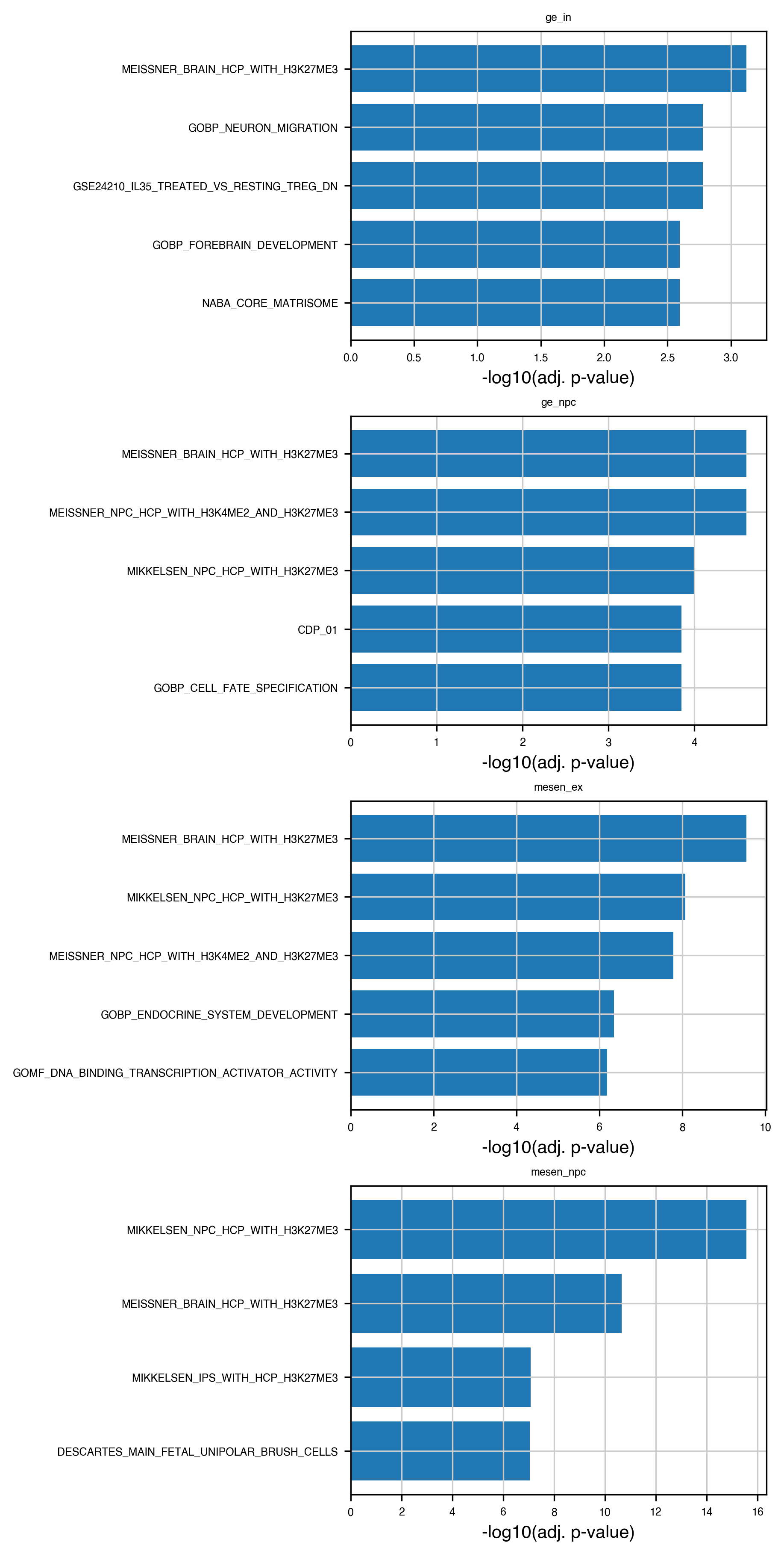
# Plot top enriched terms per group (barplot)
top_n = 5

fig, axs = plt.subplots(
    nrows=len(enr_results["group"].unique()),
    ncols=1,
    figsize=(6, 3 * len(enr_results["group"].unique())),
    constrained_layout=True,
)
if not hasattr(axs, "__iter__"):
    axs = [axs]

for ax, (group, sub) in zip(axs, enr_results.groupby("group")):
    top = sub.nsmallest(top_n, "Adjusted P-value")
    ax.barh(top["Term"], -np.log10(top["Adjusted P-value"]))
    ax.set_xlabel("-log10(adj. p-value)")
    ax.set_title(group)
    ax.invert_yaxis()

plt.show()